 Tel: +86 188 2689 9458


Tel: +86 188 2689 9458


source:Industry News release time:2023-02-10 Hits:
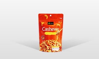
As one of the important elements of packaging design, graphics can convert brand elements and brand images into cartoon graphics when designing children's food packaging, which can not only satisfy children's interesting psychology, but also have a strong attraction to children. Domestic packaging design patterns are too formal, and food packaging lacks characteristics. It is difficult to win the favor of children's consumers according to children's psychological needs.
During the packaging design, it is a common design method to design interesting graphics and patterns to create an independent visual symbol. It was found in the survey that children consumers mainly rely on intuitive and sensual understanding to choose products. For example, home is an old candy and cookie biscuits in Japan. The brand was founded in 1910 and has been popular with the public. The main design elements of the Big product packaging are two children. Among them, the little girl showed a red tongue and could feel the satisfaction of him after eating the candy. The seductive deliciousness has caused consumers to be a beautiful association for candy. Such a simple and intuitive character graphic conveys the child's own information more directly.
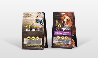
Color is the most active design element in packaging, which accounts for almost 80%of the entire packaging design. Human psychology will be greatly affected by children's food packaging colors. When watching food packaging, people first receive the color information in the packaging. When the human brain nerve receives the color signal, psychological association will be generated according to the color. Packaging spokespersons are usually packaging colors. When consumers, when food and recognition products, they usually distinguish them according to the packaging color.
Generally speaking, when people feel the low bright color, they feel tough; when people feel the color of high brightness, they will feel relatively soft. Designers can bring different food associations to consumers by matching different colors. Children are prone to color associations for colors, and children's curiosity about things comes from this. In order to attract children's attention, many packaging design on the market usually uses more bright colors to pack food, but currently rarely uses the overall color design to pack candy.
Read recommendations:
Wholesale Price Biodegradable Aluminum 3 Three Side Seal High Temperature Microwavable Food Retort S
Packaging bag printing type.recyclable spout pouches supplier
Popular recommendation
Laminated Aluminum Foil Zip Lock Bag Stand Up Pouch /Matt White Foil Pouch /Zip Lock Coffee Bag
Custom Portable Reusable Drink Bags Stand Up Plastic Spout Pouches For Beverages Liquid Packaging
Pouch with handle
spout pouch bags Manufacturing
Pouch with handle wholesale
bag in box company
bag in box wholesale
packaging spout pouch Production
flexible packaging bags
properties of flexible packaging films Manufacturing
What are the classifications of biodegradable plastic bags?
Introduction to the relevant applications of plastic vacuum packaging bags.paper snack food bag manu
What are the requirements for dried fruit packaging bags in food packaging bags.fruit and vegetables
Packing bag sealing brittle and brittle break how to do?
Why are cylindrical bag-in-box so popular?
printed snack food bags price!Introduction to the Function of Food Packaging Bags
Super Pouches: Revolutionizing Flexible Packaging for Top-Line Packaging Solutions
Coffee Pouch: Ultimate Guide
Creative design of coffee bag
Do you know these characteristics of the bag in the box?
stand up coffee bag with zipper manufacture.What is the difference between textured vacuum bags and
What is smart packaging?
What are the performance requirements of paper plastic composite bags?aluminum foil bag roll manufac
Flexible packaging film roll Packaging Manufacturing.On the Scope of Use of Food Packaging Bags
Performance comparison of PA/PET vacuum packaging bags.stand up Spout pouch manufacturer
composite packaging bag
Advantages of using plastic packaging bags.flexible pouches price
How to use sterile bags.bag in box Vendor
Talk about the future of food packaging.stand up pouch manufacturers near me
Let me talk about KRAFT Spout Pouch.stand up spout pouch manufacturers
Subscribe to Top-line emails and
stay updated on our news.
 +86 188 2689 9458
Email: info@toplinepackaging.com
Add: Room 204-205 ,Buliding 2 ,No 7 xinji Road,Nancheng street ,Dongguan City ,Guangdong province,China


 Download Catalogs


 Wechat
 Whatsapp
